How to Wear Colours You Love, That Aren’t In Your Best Colour Analysis Palette
Seasonal Colour Analysis: What It Is and How to Wear Colours Outside Your Palette
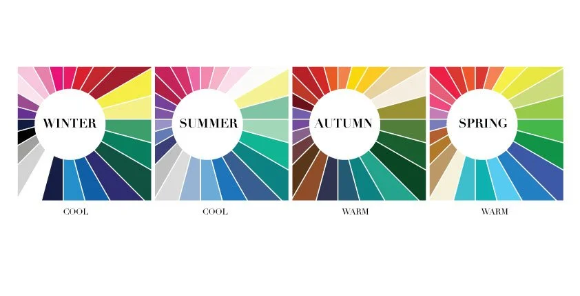
Seasonal colour analysis is a personal styling method that identifies the colours that harmonise best with your natural colouring - your skin tone, hair, and eye colour. By grouping you into a seasonal palette (Spring, Summer, Autumn, or Winter), it highlights shades that enhance your complexion, make you look healthier, and help your wardrobe feel more cohesive and effortless.
During a colour analysis, personal styling clients are always excited to discover their best colours and learn how to combine them. However, it’s very common for clients to have one or two favourite colours that don’t fall within their recommended palette. While a colour analysis is excellent for identifying your most flattering shades, it doesn’t mean you must limit yourself exclusively to them. Though on some occasions I do advise some clients to avoid colours such as light grey or camel, as no matter where they are placed on the body they look off.
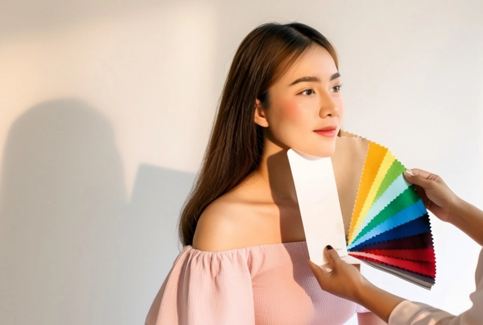
Colour Analysis
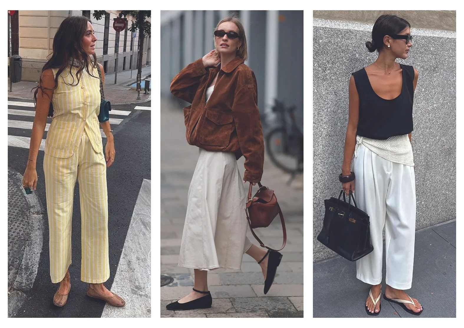
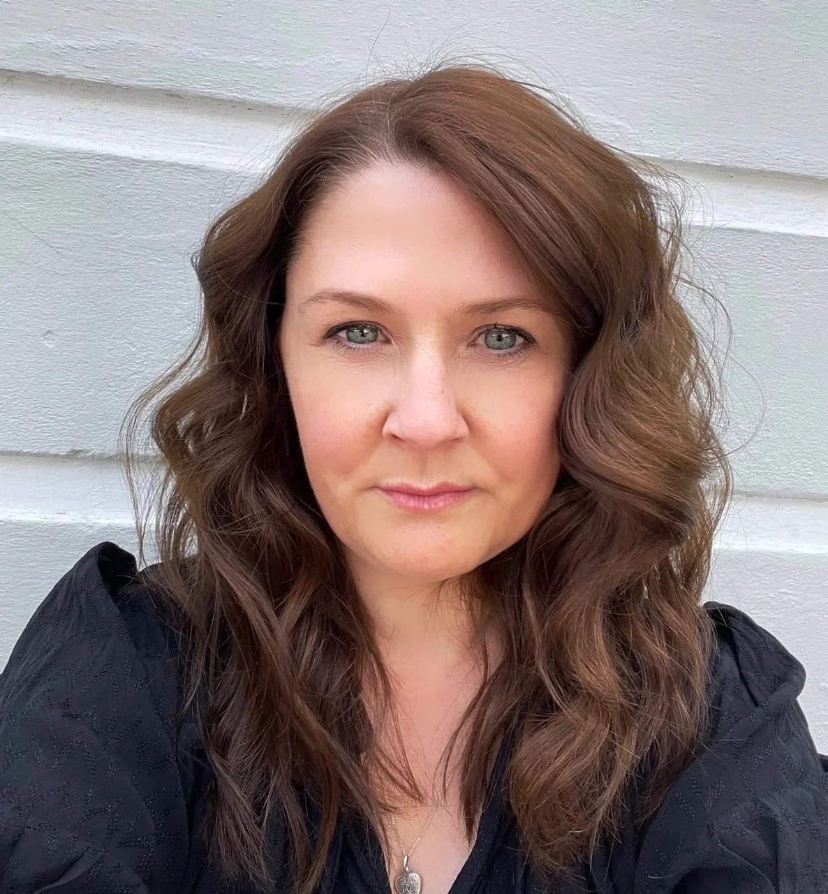
When I had my own colour analysis, I discovered that I’m a Winter - which was great news, as I had naturally been drawn to these colours for years. However, I also realised that warm, bright coral and golden yellow were not part of my recommended palette. Interestingly, I had been wearing these colours - but mostly on my lower half and on my feet. Instinctively (and helped by my background as a fashion designer), I knew that keeping these shades away from my face would stop them from overpowering my complexion or adding redness.
The placement of less flattering colours is essential if you want to wear them successfully. Avoiding large blocks of colour directly underneath the chin is just one of the simplest and most effective strategies.
Scroll down to learn more.
colour Placement
Contrary to popular belief, not everyone can wear black, as it can make complexions appear drained, with dark circles under the eyes. If you find that black - or insert colour that doesn’t suit- drains your complexion, consider breaking it up or avoid wearing it directly under the chin. Opt for a V-neckline instead of a crew or high neck. If you do choose a crew neck, add a necklace to offset the stark effect; a simple gold or silver style works well.
Fabric
Within every design team, the knitwear designer typically selects slightly varied versions of the main design colour palette. This variation arises because colours interact differently with different fabrics. For example, beige flat cotton often found made into trench coats can give off stronger warmer yellow hue than its silk or knit counterparts. Making a beige silk or knit more wearable for cooler toned people.
This is why I focus solely on colour analysis within the realm of my clothing services. It allows clients to directly experience the impact that various fabrics can have, a crucial aspect that is often overlooked.

Beige silk, knit and cotton.
Print & Pattern
Choose garments with prints that feature your less flattering colour/s alongside your best. Warm up black with browns and creams, lighten and mute cool dark tones with a pale base and brighten with an orangey reds on a dark base. This diffuses, dilutes and softens the impact of the off-palette colour.

Changing the tone with print: Autumn, Winter, Summer and Spring.
Colour Combinations
Wear an off-palette colour with another garment in a more flattering shade. For example as I mentioned before stark white also doesn’t suit everyone, which can make wearing the ubiquitous white tee challenging. Styling with your best shades mitigates any negative effects caused by the white. As demonstrated below, pairing white with orange and beige/camel tones works exceptionally well.

Warm up a stark white tee.
Accessorise
Incorporate the colour through accessories like scarves, belts, bags, jewellery or even nail polish. This allows you to add pops of colour without overwhelming your look.
Occasionally when conducting a wardrobe edit I do find items where I can’t make the colour work - often because the style also doesn’t suit. In such cases, I recommend either donating the item to charity or I will guide you to the best resale website. I do highly recommend wearing your best colours for important events such as:presenting, interviews, photoshoots, media appearances, dating, black tie and weddings etc. While wearing your best colours undoubtedly enhances your appearance, sometimes you just want to wear black etc and that’s ok too!!
How I Can Support You
For those of you interested in finding out your best colours and want to know how to wear those that aren’t as favourable, you can do this through the Wardrobe Edit & Colour Analysis or add on colour analysis to a Personal Shopping appointment.
Alternatively email me using the button below to see how I can help you.
Thank you for reading.
Lisa O’Saughnessy
Lisa works with clients of all genders and backgrounds helping them to create an elevated personal style.
Written By Lisa O'Shaughnessy
Founder of Always Stylish | Personal Stylist